.svg)
.svg)
.svg)
© 2025 tomorrowisbeautiful. All rights reserved.
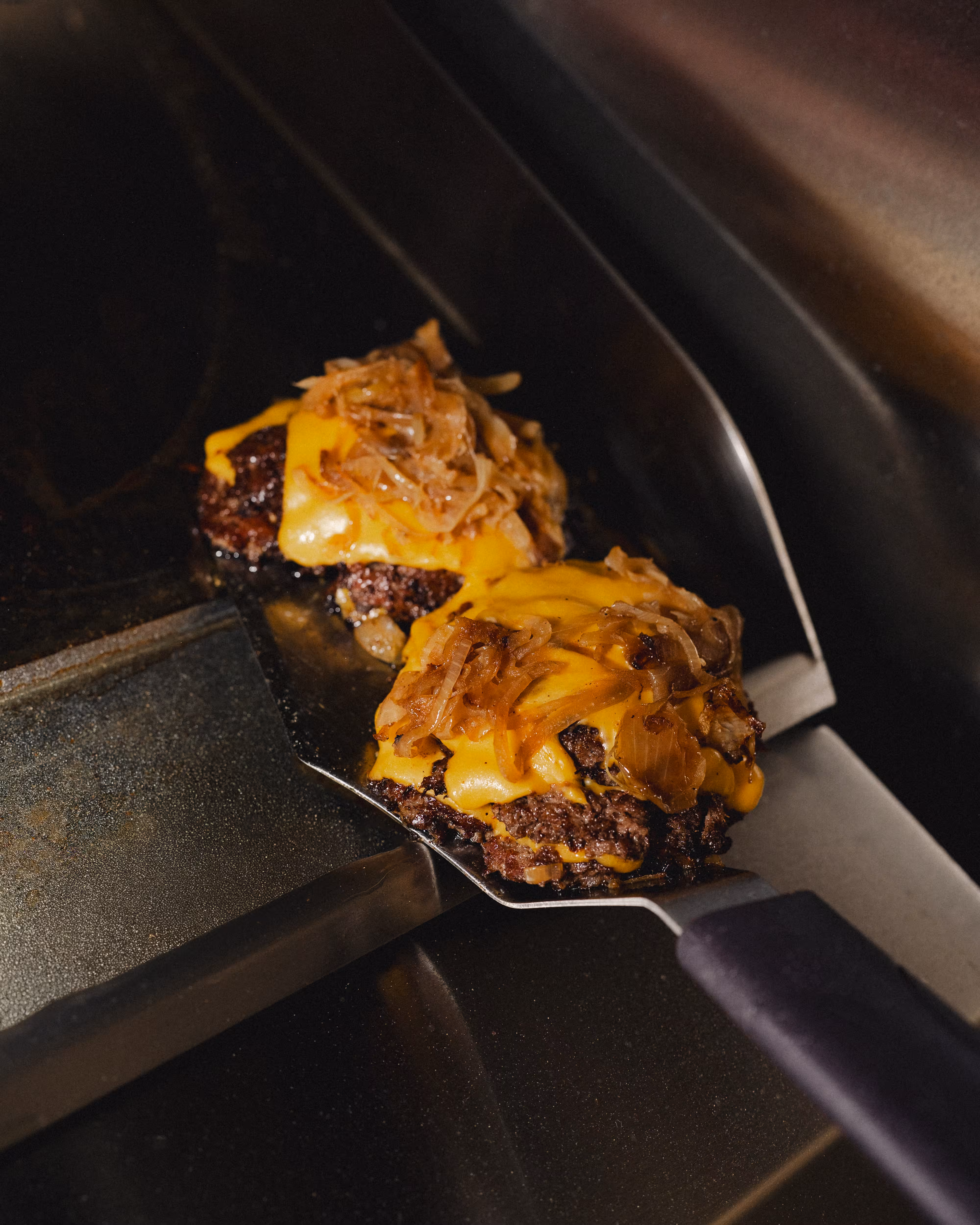
The food was already winning. What was missing was a brand system strong enough to carry it further. The founders knew that if BURGER-DROP was going to grow, the brand needed to stand for something clear and consistent.
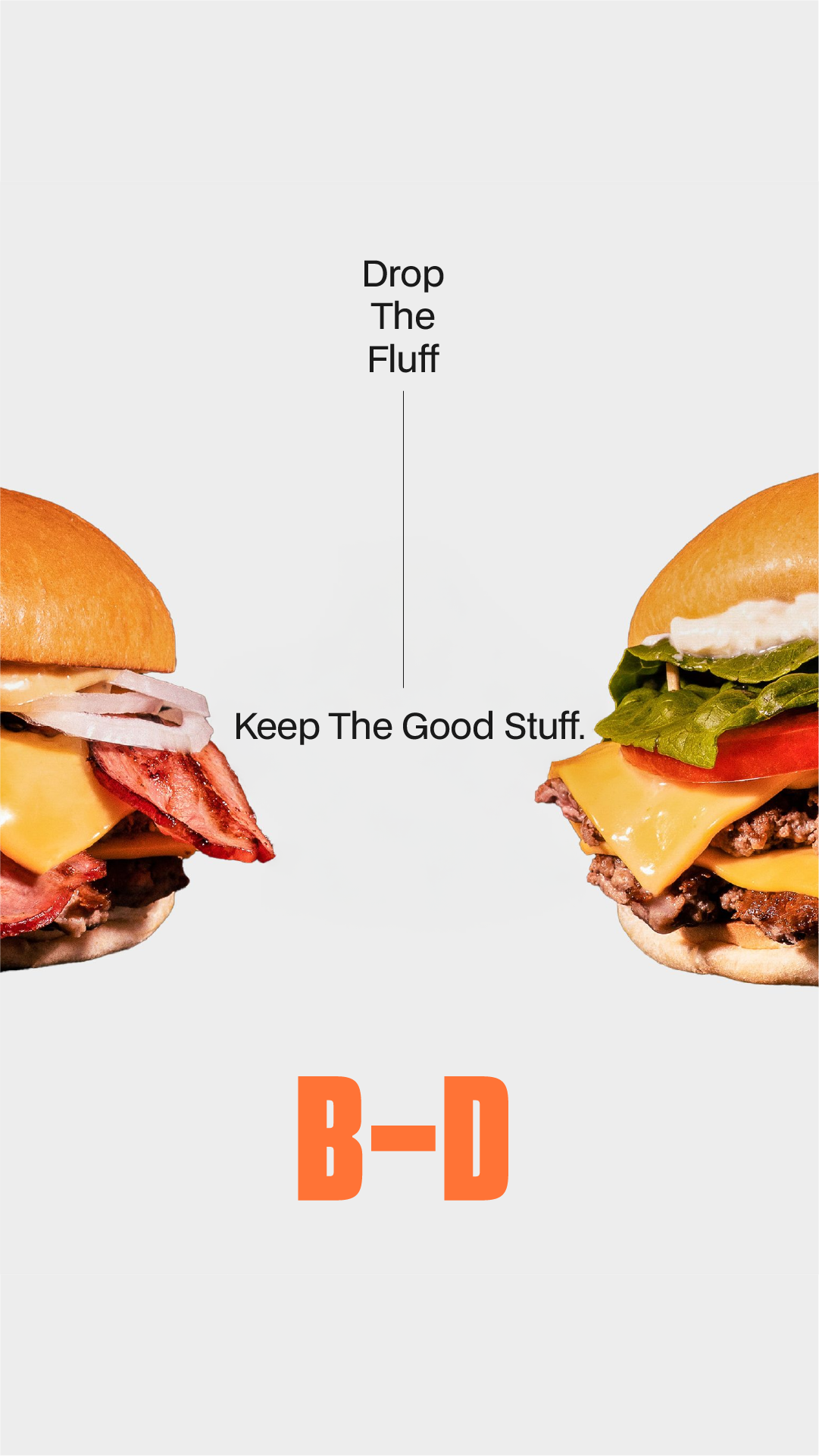
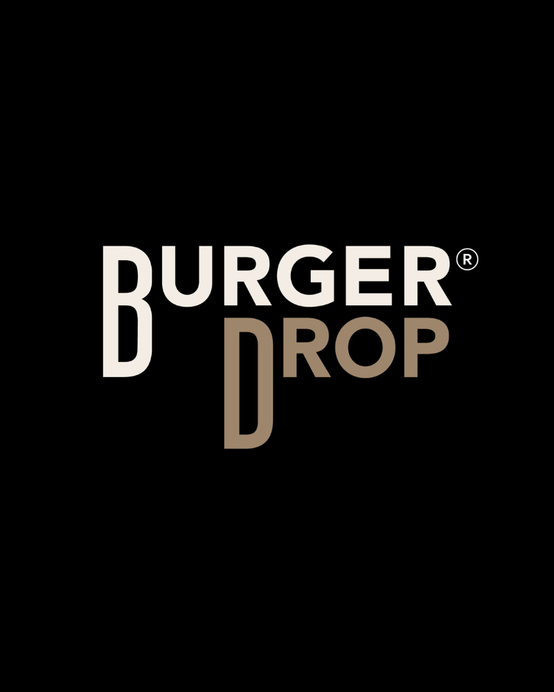
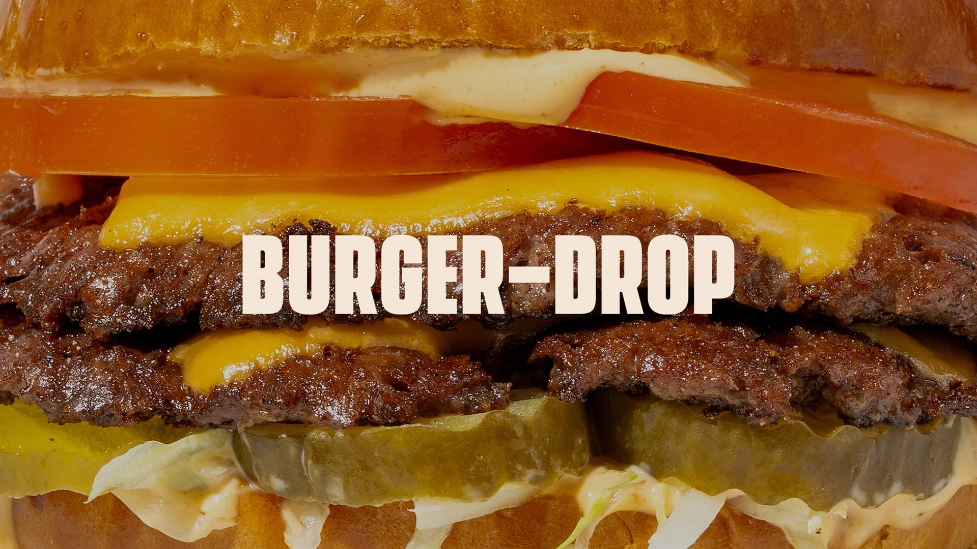
We positioned it firmly in the premium fast casual space. A confident logo, bold colour palette, and structured typography gave it immediate recognition. Messaging was refined to express quality, energy, and ambition in every touchpoint.
Most importantly, the rebrand was built as a system for growth. Every asset, from logo variations to campaign templates, was designed to scale seamlessly as the business expanded into new stores, products, and markets.
.avif)
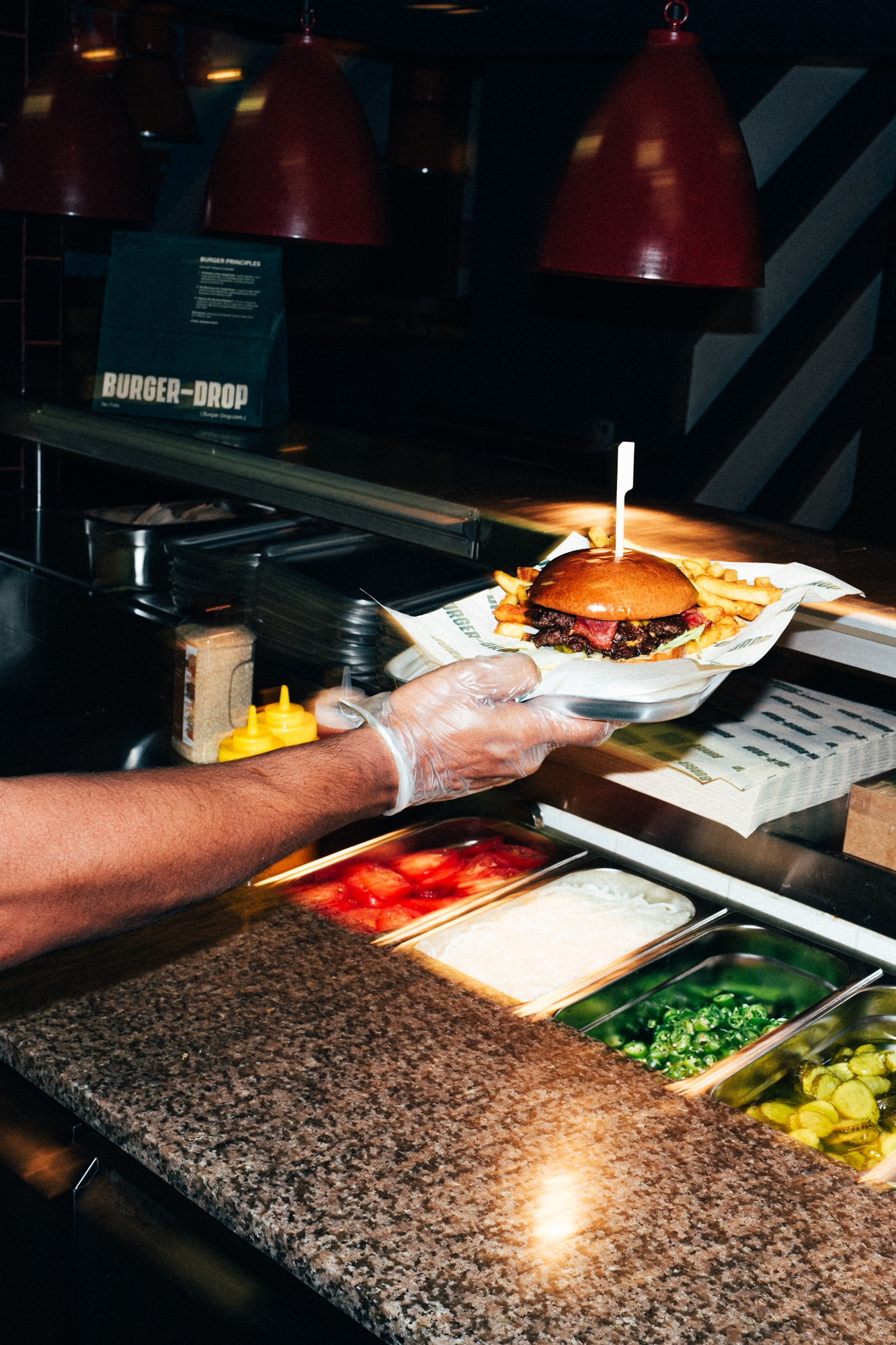
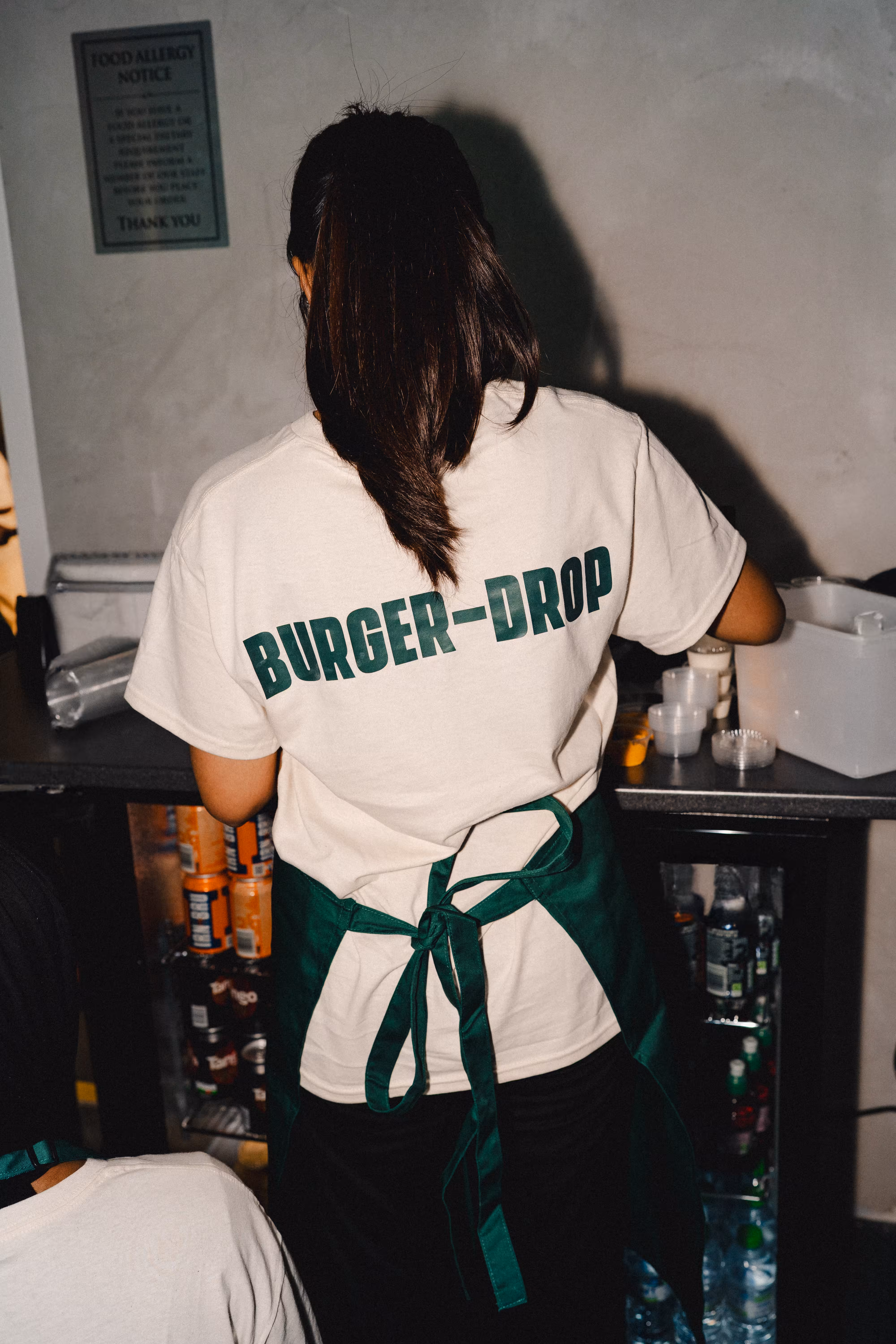
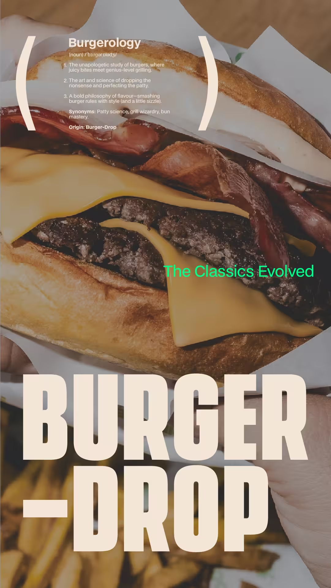
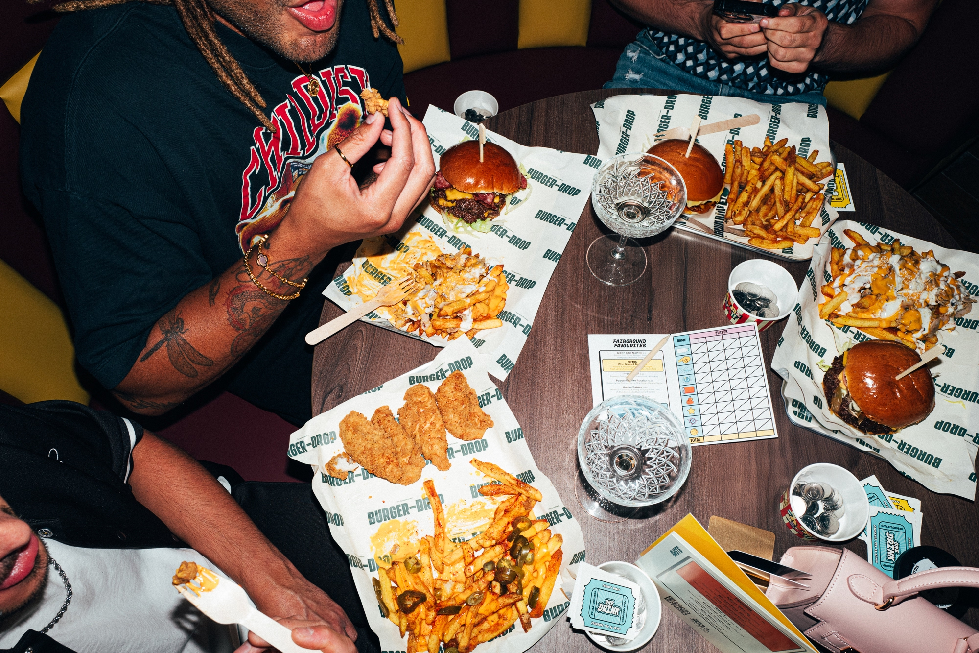
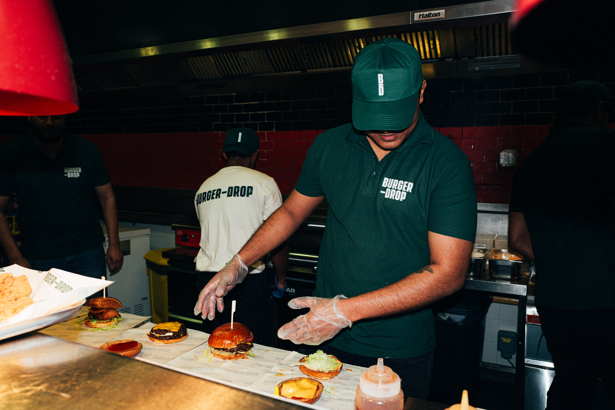
The new identity was applied across every touchpoint. Packaging, menus, delivery bags, and in-store assets were redesigned to feel modern, consistent, and unmistakably BURGER-DROP.
Digital presence shifted from scattered posts to cohesive campaigns with a clear voice. Ads and rollout content were built to look premium, shareable, and instantly recognisable. This was not a surface refresh, it was a complete system built for growth.
The customer experience improved at every stage. Ordering feels premium, unboxing is on-brand, and delivery reflects quality. Each interaction now reinforces the same message: BURGER-DROP is the burger brand worth choosing and sharing.